Showing posts with label Trading strategy. Show all posts

Wednesday, December 11, 2013

TRADING USING THE DOW THEORY

Natural talent is something that all potential forex investors crave. Knowledge and anticipation of how markets move is hard to come by and in truth, it is more of a natural talent than a learnt skill. In spite of this, natural talent alone is not enough and being successful in the markets requires hard work and dedication above all else. Regular forex education is essential if you want to improve the success rate of your trades. One simple way to boost your knowledge is to adopt a trading strategy. Here, we look at the Dow Theory and show how it can help you improve your trades.

The principles behind the Dow Theory are relatively simplistic and, because of this, it is a great tool for new traders. The fundamental belief behind the Dow Theory is that any factor that would influence the market will have already been factored into the offer price. It may be the case that such factors cannot be predicted, but, even so, they are already factored in.


Why Use Technical Analysis?

Put simply, technical analysis uses charts and graphs to predict price movements. By showing the events of the past, it is believed that future developments can be predicted.

The principals state that:
· A chart can define a trend because prices do not move randomly
· History repeats itself so changes can be tracked and charted over time
Technical Analysis, the Dow Theory and Market Trends

The Dow Theory states that you can interpret technical analysis charts by assessing three market trends. These are:
· Primary Trend: a broad trend that can for years.
· Secondary Trend: A trend that lasts between weeks and months, often correcting the primary tren.
· Daily Trend: A daily/weekly short term movement that does little to effect the primary tren.

These trends occur simultaneously and are spotted using technical analysis charts that provide a visual representation of trends.

The Relationship Between Dow Theory and Technical Analysis

If we assume- as the Dow Theory states- that markets reflect all available information, then we must also believe that an aggregate of emotions is also factored in. Such emotions will be reflected in short term trends, but will not affect the primary trend that runs simultaneously.

When assessing technical analysis using the Dow Theory, we must assume that the offer price represents total sum of hopes, fears and expectations of all market participants (including traders, investors and brokers). This means that although the unexpected can and will occur, it will never affect the primary trend, only the short term trend. In conclusion, the Dow Theory allows you to interpret technical analysis graphs and helps you predict upcoming trends. Understanding the three trend lines that the Dow Theory relies upon is essential to a successful use of the theory. Watch trades closely and take a chronological approach and you should be able to make successful trades as a result.

Friday, September 6, 2013

THE POWER OF DOING NOTHING IN FOREX

THE POWER OF DOING NOTHING IN FOREX

I will show you why doing nothing is surprisingly powerful in trading.

This simple exercise had a profound impact on how I will try to manage my trades in future. Once I open a trade and I’ve got my stop to break even its time to do nothing, just walk away.

Obviously the vast majority of my trades would have been stopped out at break even however the small percentage that survived were taken by the long term trend and became little profit pulling machines! To give you an idea of the power of doing nothing lets take just one trade from the EURUSD. I entered this short sell trade back in January 2010, it was a simple trend collapse breakout trade risking 35 pips (2% of my account) and I took profit at around 95 pips. Which is not bad right? I risked 1 to get almost 3. (see details of the move at end of this post)

Now lets take a look what happened if I did nothing. The Daily trend took this trade and it never came back to hit my break even stop. In June 2010 it hit a maximum profit of 2410 pips and if it wasn’t closed it would be sitting right now at 1250 pips. Realistically I believe any long term sell positions on the EURUSD would have been closed the moment the head and shoulders pattern played out on the daily chart at the end of June. This would have closed the trade with a profit of about 1800 pips.

Now here is the shocking part!

Remember that the initial risk on this trade was 35 pips, which was equivalent to 2% of the trading account.Closing the trade at 1800 pips would have resulted in a gain of 102.8% on the account! Remember, this is just one trade!

Obviously this doesn’t account for some losses also taken during that period. But to give you an idea of the power of doing nothing lets take the worst possible scenario. Lets say I’m the unluckiest trader alive and after that trade I lost every single trade I took on the EURUSD to date. My account would still be sitting at a gain of 56.8%! Thankfully I’m not the unluckiest trader alive and that trade was just one of many positions that that would have survived the trend fluctuations without being taken out at break even.

Keep in mind this is only on one pair!

Ok, so back to reality… It would be great to trade this way and I am confident that if I just took trades, moved to break even and then did nothing I would be a more profitable trader. Unfortunately I am human and having trades close at a loss or break even for weeks on end would be extremely difficult to cope with. A logical solution would be to split your positions into two. One half would be treated as normal and closed at your usual target resulting in a nice small gain on your account. The second half would be set at break even and left to hopefully catch a ride on the long term trend. Using this method in my example above that one trade would have still netted over 51%!

Hopefully this has given you the push to do some testing of your own but in the end it just boils down to an old, but very wise quote…

“Cut your losses and let your profits run”

(see details of this move posted in Apr 2010 by a former MIGBANK Researcher here Euro Crisis)

Friday, August 23, 2013

HIGH PROBABILITY DIVERGENCE SETUPS

Welcome to the second part where I am explaining how you can use divergence with some tips and tricks I have learnt over the years to pinpoint market turning points with high accuracy. 

In the part 1 (price swing prediction) we discussed standard divergence and what to look for with your preferred indicator to spot this setup. Now its time to dig a little further and see how deep the rabbit hole goes! 

High Probability Divergence Setups!

Through years of trial and error I have discovered what works and what does not. Divergence by itself is a bit hit and miss, you never really know if the divergence will play ball or not. This is probably why many traders give it a try then decide to leave it for something 'supposedly' better. Sadly, they didn't know how close they were to the pot of gold!

By combining divergence with some simple price action tools we can turn that hit and miss setup into a very accurate entry technique.

Before we go into these tools, let me show you my absolute favourite type of divergence. I call it the DTD & DBT (double top divergence / double bottom divergence). This type of divergence has pinpointed trend reversals more times than I can remember. All you are looking for is a double top or double bottom in price then for your preferred indicator to also show strong divergence. 

Below is an example of a DBD on the GBPUSD 4H chart, this setup captured a 700 pip trend reversal! In all examples below I am using RSI indicator set to 6 for divergence.
I know what you're thinking, that was cherry picked and just a one off right? Wrong, these setups happen all the time across all pairs, in fact lets take a look what happened at the end of the 700 pip move shown above.

Yep you guessed it another DTD which again captured a trend reversal of almost 900 pips!
The reason DTD and DBD setups are so powerful is because they combine confluence of support or resistance into the setup. In order to have similar success with standard divergence you will need to be extra picky about the setups you choose. Look for setups that happen as price is coming up against strong areas of support or resistance.

Timing Your Entries!

Entry's can be tough because most entry techniques are lagging and therefore get you into the move late eating into your potential profits. But don't worry, I am going to show two price action entry techniques I use all the time with astonishing success trading divergence setups.

Once I have a DTD/DBD or standard divergence with strong confluence I start watching price action at the close of each new candle. I am waiting for one of the two candle formations below to clearly appear. 
Once the candle formation forms and the candle has closed (very important) I enter at market with stops above/below the candle formation.

If you take another look at the two setups above on the GBPUSD you will see that both setups triggered with an engulfing candle formation! A fluke? Nope, this happens all the time :-)

Ok, so that's part two of this mini divergence course over and done with hopefully it has provided you with some new tools to add to your trading toolbox. Remember, the key to success is to be picky, wait for strong confluence to line up or better still a DTD/DBD setup.

We are not done yet though,  Follow me
over the next few days for more awesome divergence tips and tricks.
Have fun & good trading!

Sunday, August 18, 2013

BANK TRADER REVEALS BREAKOUT STRATEGY

Hello traders,

Today I would like to show you a technique that is valid for all currency pairs and all time frames (my group in the bank tend to use it mostly on the Daily and Weekly charts to avoid market choppy noise). The name of this strategy is the Breakout, Congestion and Continuation pattern, and it’s a high probability setup given the right circumstances. If you master this technique, you could achieve a 75% to 80% win/loss ratio!

The key concepts are the universal pattern of any currency pair : continuation pattern after a strong momentum breakouts of key Support / Resistance levels, using candlestick formation made by 3 consecutive candles.

Search for the pattern only upon the breakout of a significant horizontal level of support / resistance 

The pattern : You must see a solid breakout candle breaking through the Support / Resistance level

Don't trade if you get "shaky" breakout candles

Trade only when you see one small candle beyond the support / resistance level, then place your stop orders as shown below

Close 50% of the trade at the close of the first continuation candle, then move stoploss to break even.

Finally, close remaining 50% of the trade at the close of the second continuation candle.

There is 75%-80% winning ratio if you follow this strategy. Good luck !

Saturday, August 10, 2013

HOW TO PREDICT PRICE SWINGS IN ADVANCE

Have you ever wished you had an indicator that would predict a price swings in advance? Well chances are you already do, it's just that you have yet to discover how to harness its power. 
Confused? Don't worry it will become clear! 
I'm not a big advocate of indicators, I do use some common indicators in my trading but all indicators have a major flaw when it comes to trade entries. Indicators follow historic price and consequently are always lagging behind price. However there is a technique to use selected indicators in relation to price structure, which can give you an accurate leading indication of when price will turn! 
I am of course talking about Divergence. I know divergence is no big secret, but when used properly it is extremely powerful in predicting price swings. If you have never used divergence then you are in for a real treat. If you already use it then hopefully some of these tips and tricks will help increase your accuracy. Over the next 2-3 posts I will share with you what I have learnt from the many years of trading divergence setups. I have a tested a multitude of different indicators, entry techniques and time frames. I have discovered through backtesting plus trial and error what works and what does not. 
First things first, lets get the basics out of the way, once you have a grasp of the basics we will discuss some cool tips and tricks I use which will help you spot these powerful setups plus get in at the right time.
For standard divergence, we are watching the highs and lows of price in relation to the highs and lows of the indicator. In an up trending market we are watching the higher highs and waiting for the indicator to begin showing lower highs. In a down trending market we are watching the lower lows and waiting for the indicator to begin showing higher lows. 
Please see my crude sketches below for reference. :-)


The red doted price line indicates the expect direction of price due to the divergence setup.
What indicator should you use? 
Many oscillators will work fine for spotting divergence. Here are a few that I have used with great success.
- MACD (trigger lines or histogram) 
- Stochastic 
- RSI 
People tend to have their own favourites so have a play around and see what suits you. 
A high percentage of the time strong divergence can be a good indication that the current trend is over at least temporarily. So not only can you take advantage of the divergence swing you can also use it to manage trend trading methods. 
This stuff will work on any time frame but in my experience it is easier to spot on 4H and Daily charts so you may want to start there. 
In the next post I will show you another type of divergence which is extremely accurate and my personal favourite. I will also discuss some little tricks I use to help increase the accuracy of these setups even further. 
Your mission - should you choose to accept it, is to head over to your charts, go back over the history and start looking for divergence. Have a play with a few indicators and see which you prefer. 
Before I go I will leave you with one quick example of how powerful divergence can be when used properly. The chart below is a 4H chart of the EURUSD just before the huge trend reversal
Keep a close look out for part 2 (high probability divergence setups) of this series. Have fun & good trading! 


Tuesday, July 16, 2013

TREND EXHAUSTION COLLAPSE STRATEGY

Trend Collapse Forex Strategy

Today I want to share with you a powerful Forex strategy that works on any time frame and any currency pair because its principles are virtually universal. This strategy seeks to exploit the sharp reversal moves we occasionally see in our charts once an established trend shows weakness. When this happens, traders who had been riding that trend are very quick to protect their hardearned pips by closing out at once all their trend-based trades, and therefore the market bias suddenly changes. 

When a trend starts collapsing

Everyone says that the safest way to trade Forex is by trading only in the direction of the trend. But what about when the trend comes to an end? Should you stop searching for trading opportunities altogether? Not at all!

In fact, when a trend begins to lose its momentum, the market goes through a period of sudden “mass panic” as every trader closes his formerly-profitable trend-riding positions before the trend goes belly up. So… what happens when a large portion of the market jumps out of the market at the same time? well, basically the market -and the former trend- collapse!

And right THEN and THERE is exactly when you want to be ready to profit from that sudden market collapse.!

I hope you enjoy and use this strategy… trust me, it’s powerful stuff!

The outer trend line

In order to define the breakout point, meaning the point upon which the market will deem the trend as weak or as jeopardized, we must draw the trend’s outer trend line. This trend line is to be set from the trend’s original focal point. It’s impossible to determine an exactly number of bars or candles we are to scroll back in our chart in order to define the trend’s starting point, so that’s something that you, as a trader, will have to gauge from a visual point of view. Please mind that we’ll only be interested in the very outer trend line, so please do not draw any inner trend line at all. The outer trend line is the last line of defense for a trend, so once the outer trend line give way, there’s nothing beyond to hold the price fall. 

The Pullback

Upon the breakout of the outer trend line, we’re not to trade the initial breakout thrust. Initial breakout thrusts are risky because we might be caught up in a fake breakout. In order to protect ourselves from these fake breakouts, we will wait for that initial breakout thrust to die out and then we will wait for the first swing pullback.
That first swing pullback usually comes back to rest either breakout levels or the outer trend line from the other side. That’s precisely where we’ll be hiding behind the bushes, ready to enter the price as price eventually pulls back to either of the mentioned levels.

Trade strategy set up

As already mentioned, we will enter the trade exactly at the moment when, after the pullback, price begins to turn again in the direction of the original breakout. Needless to say, we will be trading only in the direction of the original breakout, or what’s the same, in the opposite direction of the trend that has just broken.
Basically, the idea is to wait for the pullback to be completed so, once price begins to curl around once again in the direction of the original breakout thrust, we can jump onboard as tightly as possible from the bounce point.
There is no particular formula or price pattern to trigger the trade. We will simply try to be as nimble as possible in order to trigger the entry just as the bounce begins to take place. It’s important to enter into the trade as close as possible to the bounce point, but without actually getting ahead of it: firstly we wait for the pullback to die out, then we wait for the bounce, and then we simply trigger the trade as nimbly as possible.
The stop loss will be placed immediately beyond the bounce point.
We will use a three-point exit policy, exiting a 33% of our lot size at each consecutive level:
• Target #2 will be around the end of the initial breakout thrust.
• Target #1 will be mid-way through between our entry level and our target #2 level.
• Finally, target #3 will be located at the projection of the full breakout swing measured
from the bounce point.
We will trail our stop loss to break-even when price hits our Target #2.
Here is a live examples of the Trend Collapse strategy applied to actual real Forex charts.
Please mind that this strategy works on…
• Any currency pair.
Any time frame (best used on H1 chart and above though).
• Any market direction (both after a down trend or after an up trend, the market dynamics and the way to trade this technique are exactly the same). 


Your Questions and Comments Are Always Welcome !

HECTOR DEVILLE HINDSIGHT ORACLE INDICATOR

This indicator based on the Repetitive Nature of the markets and price pattern. The Hindsight Oracle analyzes current market conditions and current price patterns, then browses through historical data searching for the same patterns. Based on how price developed after those past patterns, it gives out a potential outcome.
Original Price$197
You will get a high probability projection of upcoming price behaviour, the indicator will also give you a quantified projection in pips, if the projection goes according to your plans, you have green lights. If not, it keeps you away from problematic trades.
  
This unique advanced indicator price is worth 197$, work on any instrument: forex , gold, index,.....etc
Original Price $197
Discount Price $27
Instant download, no limit, no expiry, forever usage 

Saturday, June 22, 2013

THE MOST ADVANCED FOREX INDICATORS

Hello there !
Do you know what the Trend Scanner and the Forex Currency Index are? Well, they're probably two of the most advanced indicators in the Forex industry!
  • Trend Scanner: searches for trends in ALL currency pairs and time frames... simultaneously!
  • Forex Currency Index: spots market inherent strength and weakness, and tells you where temporary unbalances can be found.
They are specifically programmed by savvy trader Hector Deville's coder, and they're INSANELY powerful.
Here's the video :

Price is 37$ for both Indicators. Instant download, no limit, no expiry !
Any question, email to lumina920 [at] nokiamail [dot] com

Saturday, June 8, 2013

MULTI TIME FRAME TRADE ADVICE INDICATOR

Trend_alex is a multi timeframe indicator to identify the trend. It's advantage is the advice to open trade or wait for better moment, Trend Indicator Alex is very simple to use and fits any trader. By default it measures trend in 3 timeframe : 15M, 1H and 4H
Rule to enter trade is very easy, just follow the text displayed on your chart, Buy/sell when it tells you to buy/sell and there are 3 level to take profit displayed on the right side to help you decide when to exit the trade, example is below :
If you buy this system, you will receive the Super Trend Norepaint Signal  FOR FREE
Price is 27 USD, no limit, no expiry, instant download 
Any question, email to marketivaster [at] gmail [dot] com

Thursday, May 16, 2013

How to Avoid Failed (Invalidated) Harmonic Pattern

The Harmonic Pattern is so popular and we all agree it really works !! Many of Harmonic Trading topics are full of succesful screenshots of Patterns like Gartley, Butterfly, Bat ...etc. What about the opposite, the invalidated (also called failed) ones ? 
In fact, Harmonic Pattern success rate is only about 80%. 
I'll start posting some of failed cases and then I will show how to avoid it. Following examples present invalidated/failed patterns:
This is an emerging Bullish Gartley Pattern, deteced by one Harmonic Pattern Indicator, price was supposed to go up after the pattern is displayed... . what really happened afterward is price continuing down and the Harmonic Pattern expand it's right wing and failed eventually
Here are more definitely failed pattern:
The pattern signal a short sell but price still go up
Bullish Butterfly doesn't work !!!
That's why we have developed an extra confirmation oscillator to increase the successful ration of the pattern, it will filter out failed pattern and also reduce the number of potential trades. But as veteran traders Sive Morten has taught: "...Trader should better accept losing trading chance than losing trading capital..", I am happy to introduce it to you Super Trend Oscillator.
Come back to the very first screenshot in this post and compare the entry signal with the screenshot below, you will see how it pick the perfect bottom:
Compare this screenshot with the very first chart in this post to see how good it generate Buy Signal
Here is an overview of the whole system :
All Signals are generated consistently with the Emerging Harmonic Patterns and help you confidently enter the trade without worrying it would fail
Another successful case :
Here are our feedback of a recent Japanese Customer :
Happy recent customer !
This Super Oscillator is provided along with Harmonic Pattern Indicator for Price 27$. Instant download, no limit, no expiry !

Any question, email to lumina920 [at] nokiamail [dot] com.

Thursday, May 9, 2013

How MACD Indicator can Count Elliott Wave

Hello 
In this post I will show you how I use MACD Indicator to count Elliott Wave, this method is very useful and easy to apply, especially when the price starts moving  in a new trend. And why I say it is useful and valuable ? Because when you can predict the price movement, you would know where the price will probably head and where it will potentially stop, this helps trader with many opportunities to be profitable.
The screenshot below is the EURAUD 4H I took just now , as of May 9th 2013, you can see the price has breaked the downtrend.


Now I will zoom in a bit and explain the rules how I count the wave : 
  • The peak of MACD wave is usually the 3rd wave of price in Elliott Wave Theory ( I assumed you already know the basic of Elliott Wave, if not, I will send you free ebook to learn about this, click Subscribe to be notified when it is available )
  • When MACD gets close by zero, it indicates the retracement waves (wave 2 and wave 4) are completed.
  • Divergence between price and MACD in the last wave usually show wave 5 is running out of fuel and it is the end of whole 1-2-3-4-5 wave.
Here is the chart how I count the Wave.
If you like this post , then Subscribe to my newsletter to receive further similar Analysis.

Monday, December 29, 2008

When is a pattern not a pattern?

A guide to avoid loss making trades

When is a pattern not a pattern?

The easy answer to the question is “when it’s not a pattern”. And that really is the real crux of the issue… Let me explain.

Let’s take a look at one of the most simple patterns in technical analysis, the Double Top (Bottom).

This is the hourly chart of Dollar-Swissie in a run up from the 1.0883 low which found a high at 1.1324. Following this it pulled back lower and then attempted to move back to the high once again. However, it failed just 6 points from that high and then declined quite sharply.

In this process it formed what we call a “Double Top.” This is a classic reversal pattern that through measurements will provide a minimum target in the reversal. Basically, by taking the number of points from the peaks and the intervening corrective low it is then possible to project lower from that trough to generate the minimum target.

In this example the pattern has worked perfectly. What is more, the Rapid RSI below has formed what is a bearish divergence. This is recognized by higher price peaks from the intermediate peak towards the left center of the chart to the eventual 1.1324 high. However, over this period the RSI has not made new highs – but the RSI makes a lower high at the 1.1324 high which represents a slowing in the underlying momentum of the trend.

A combination of this bearish divergence and a subsequent break of a trend support line and failure on the retest of the trend line sets up a stronger reversal which meets the minimum target perfectly.

OK, this is simple, let’s look at another example:

Here we see exactly the same thing happening in the hourly Euro chart. Price has rallied strongly with Rapid RSI forming a high at 1.4751 and then on the pullback lower braches a trend support line. Following the initial decline price rallies back towards the 1.4751 high but fails on the retest of the trend line.

This looks positive. Measuring the points between the twin highs and the intervening trough, from the current price there appears to be 300 points profit.

So if I take a trade of €1mn I can make €30,000 profit and buy a new car…

Well, this is what then happened.

Ah… the Euro actually continued rallying.

So why did the Double Top pattern fail?

As I said, because it wasn’t a double top pattern…

It is vital to understand that a double top only becomes a double top when the intervening trough is breached. (And a double bottom only becomes a double bottom when the intervening peak is breached.)

Clearly this didn’t occur here.

This is very simply explained by examining the definition of an uptrend – which occurs when both highs are moving higher while lows are also moving higher.

If we want to be safe in identifying double tops (or bottoms) we should also satisfy the requirement that the sequence of higher lows is broken – which would be when the intervening trough is breached.

Therefore, avoid this simple error which many still fall into by ensuring that the intervening trough (or peak in a double bottom) is broken to confirm a breakdown of the trend.

Gook luck !

Friday, December 5, 2008

Overbought and Oversold RSI Readings

One classic interpretation of momentum indicators is that of overbought and oversold. Normally these are quite good signals when used within a consolidating market although mere oversold or overbought readings should not be used to buy or sell (respectively) without other forms of analysis and preferably in shorter term time frame charts.

However, these overbought and oversold extremes can be useful within trends also. In this type of interpretation it is vital that only trades in the direction of the trend be taken.

First we should remind ourselves of the definition of a trend.

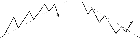
Uptrend: is a sequence of higher highs and higher lows
Frequently, though not always, a trend support line can be drawn across the lows

Downtrend: is a sequence of lower lows and lower highs
Frequently, though not always, a trend resistance line can be drawn across the highs

A good reversal signal at the end of a trend may well be the break back below the support line in an uptrend or above the resistance line in a downtrend. In addition, to confirm the reversal completely a break of the last major swing low in an uptrend or the last swing high in a downtrend will also cause the uptrend to be complete.

The following chart is that of the daily Euro-Dollar chart which clearly has shown a strong and persistent uptrend over the course of both last year and this year. Note how all the major lows remained above the previous low in the move and this was accompanied by higher highs in all cases. Very clearly this can be described as a major uptrend.

Below the chart I have added Rapid RSI. I choose this form of RSI since it is more volatile and reaches overbought and oversold extremes more frequently than the traditional Welles-Wilder formula.
What can we deduce from the chart?

Well, at the left of the chart price was actually seeing a sideways trading range. Both overbought and oversold provided good signals. At these extreme readings, if the 4-hour and hourly charts also showed reversal signals they would have been worth following.

What I do want to point out is that overbought readings of RSI in an uptrend need not necessarily mean that the price is actually overbought. Unless they are accompanied by bearish divergences I tend to look at overbought readings as actually meaning “the market is still bullish.”

This does not always mean that price will continue higher and in most cases there is a pullback, but note how on those occasions that when RSI reached oversold while price has not penetrated the last low point, then it actually provides an excellent buying signal.

You will still need to confirm those oversold signals in the shorter time-frame charts, and it may well be worth combining these signals with the support and resistance supplied by an analytical forecaster. However, very clearly the mere fact that in an uptrend, following a price high that is marked as overbought by RSI, the move to oversold can be an excellent signal to take advantage of the next leg higher.


Now, we have just seen RSI move to overbought at the 1.4966 high. There is one difference however which is that this overbought level has produced a bearish divergence and at a time when price is poised just above a support line that has run from the 1.3359 corrective low. Breach will suggest the trend is complete and take price down towards the 1.40-1.41 area. This should cause a correction as the market remains very bearish Dollars but the technicals are suggesting that a new high in the Euro will not be seen.

The use of (Rapid) RSI in this manner does highlight an alternative method of using overbought and oversold extremes to great effect.

Monday, November 3, 2008

Stochastics Cross Signal

A useful strategy to reduce your losses using stochastics crossover signals

Stochastics are often used to generate buy and sell signals when the %FastD crosses above or below %SlowD. Just how good are these signals?

The stochastic plot here shows where entries are indicated:I have not circled all the signals but just four in the center of the chart that only shows the stochastic plot. The buy signal occurs when %FastD crosses above %SlowD and the sell signal occurs when the opposite is seen – when the %FastD crosses below %SlowD. However there are two other signals in between that provide first a sell signal and then a buy the next bar. This is rather annoying.

Let us seen how the entries might look on a chart.
Clearly, when there is a modestly sustained move the Stochastic crossovers can provide a reasonable profit but all too often in the small, rather tight range consolidations it can give back much too much of hard earned profits.

Is there any way we can try and prevent this give back? I tend to consider the plain signals provided by momentum indicators as too simple and in a way that doesn’t really fully take price development into consideration. Does a reversal of the %FastD through %SlowD constitute a directional reversal? Personally I do not think so.

Then what does represent directional reversals? Well, if you go back to a fundamental premise on what constitutes a trend it can be defined by looking for higher highs and higher lows in an uptrend and vice versa for a downtrend. If we then just trade without looking at the price chart just because %FastD has crossed through %SlowD then we’re really not think about what we’re doing. Quite often price can see a one or two bar reversal but not to the extent that it penetrates the most recent sequence of higher lows (in an uptrend) or lower highs (in a downtrend.)

What we can do is stipulate that we’ll only buy on a Stochastic cross higher if price penetrates the last swing high, or if the Stochastic crossover is lower then on the breach if price penetrates the last swing low:You can see by doing this it does reduce the number of trades dramatically but actually takes out most of the losing trades. The first short sell to the bottom left of the chart will produce a loss – but this is compared to 6 losing trades without the price filter. The long trend is kept intact in the center of the chart as price rallies and is reversed soon after the peak. We then see two sell signals with no buy signals.

The techniques is not foolproof, as any methodology has its weak points at times, but it can be seen that using a price signal along with a momentum signals can dramatically reduce the number of losses you may need to take on using such a strategy.

Friday, September 19, 2008

Using Divergences to Identify Market Reversals

Using divergences correctly can help spot key market turns

Many traders and analyst use price-momentum divergence to identify trend reversals. For those of you who are not familiar with this term divergences may be defined as follows:

* Bullish divergence: When price lows are lower in a trend but momentum lows are higher
* Bearish divergence: When price highs are higher in a trend but momentum highs are lower

Basically what this is effectively saying is that momentum, that is the pace of the trend, slows then the underlying momentum indicator will not confirm the new price extremes by making new momentum extremes.
For example, it is easy to see from this chart that there has been a strong uptrend.
Below the price chart is a form of the Relative Strength Index (RSI)

Note how the RSI is showing a bearish divergence. As you can see price highs are still rising but the RSI peaks have begun to fall. This is a feature that often accompanies a stronger reversal in the trend.

Is this a confirmed reversal signal ?

Let’s see what happened next:
In fact the uptrend continued in spite of the divergence.

While this special version of RSI provides better divergence signals it is vital that price also confirms a reversal. This can be done using several methods.

Firstly, by considering the definition of an uptrend:

Price is making higher highs and higher lows.

To confirm price reversal then we should wait for it to decline below the last significant low. In the first chart price had declined very little and therefore the risk of price continuing its uptrend remains.

Secondly, by looking for break of a trend support:

In this case no break of the support line was seen until after the 2.1160 peak. This was also accompanied by a bearish divergence and therefore confirmed the reversal of the trend.

Note that after breach of the trend support how price later moves back to retest the line. This often provides excellent trade opportunities.

It is a common error that traders anticipate a trend reversal merely because there is sign of a divergence. However, this is not a 100% safe strategy. Unless there are other indications to confirm it is safer to wait for confirmation of the reversal.

Good luck

Wednesday, September 17, 2008

MA and bollinger tighten

Bollinger bands are very useful in determining price direction. You will notice that whenever the bands tighten, price explode out in a direction that is pretty much determined by the attitude of the 200 EMA.

Tuesday, June 3, 2008

A useful directional oscillator

Have you ever looked for an indicator that could provide you with a broad indication of price direction? Well, here’s a nifty little indicator that could help.

It’s very similar to MACD but tends to suffer fewer whipsaws in flatter corrections. The basic concept behind the MACD indicator is instead of using the crossover signals of two moving averages to base signals, it assigns one (exponential) moving average to represent price and a second, longer (exponential) moving average to represent the underlying direction of price.

The problem with just using the crossovers of two moving averages is that the signals can come very late and much of the directional move can be complete when the signal is finally generated.

The MACD, by measuring the width between the averages, is more sensitive to how fast the averages are moving apart (divergence) and also how quickly they are moving together (convergence.)

The drawback of MACD is that it can be so responsive to changes in direction that it can provide a signal too quickly.

The challenge is therefore to devise an oscillator that will remain responsive but avoids some of the premature signals.

Therefore, what I did was use a linear regression average. While all averages have a lag due to the look back period the linear regression average tends to remove some of the lag and move closer with price itself.

What we could do as an indication is merely take the close price and deduct the value of the linear regression average. However, as you can see from the following image it produces a rather choppy result from which signals are not obvious or even useful.

Raw Directional Oscillator

Therefore the challenge was to provide a signal that was more a reflection of the underlying direction. To achieve this I took an average of the linear regression average but to retain sensitivity I used and exponential moving average that gives more weighting to recent values. I used the same period for the exponential moving average as I did for the linear regression average.

Then to avoid whipsaws from price I used a 10 period linear regression average of price. Now, the result is far more useful…

Smoothed Directional Oscillator

Basically using the crossover of the oscillator through the zero equilibrium line we can generate signals. Very clearly such simple signals are rather raw and we should at least use some basic common sense.

For example, to the middle right of the chart we can see a period of consolidation that caused the oscillator to drop below zero and then recover. When seeing this we should remember that using indicators blindly can make us ignore very simple rules.

We can see that price is consolidating and in these situations it is far wiser to trade on breaks. If price had fallen to break below the first corrective low then it would have been a stronger signal. Until that occurs we can still see that both highs are rising and lows are rising which indicates a potential uptrend.

We may choose to square a long position and then renter once a stronger signal has been generated. If the general trend in a larger time frame (this chart is hourly) we could choose to remain in the position. In this situation it would have paid off.

Good luck !

Friday, March 9, 2007

Multiple Time Frames combine with RSI and support/resistance

A technique to improve your trading decisions

Have you ever seen RSI overbought and wonder whether it was the right time to sell? Let’s face it, an overbought reading in a momentum oscillator can merely mean that price is strong and may even turn into an uptrend.

Is it a valid overbought signal? Do you sell? Where do you sell? Where should you place your stop?

Quite often using two charts of different time frames can help. For instance, let us suggest you have seen an overbought reading in the daily chart but there is no bearish divergence. What you can do is look at a shorter time frame chart, a 4-hour or 2-hour chart to see what is happening there an whether a more accurate sell signal can be identified. Let us look at recent example in EURUSD:

Daily EURUSD

Above is the daily chart of EURUSD as it approached 1.3258. Daily Rapid RSI was showing an overbought reading but there was no bearish divergence. From this chart alone we probably couldn’t work out whether there was a selling opportunity or not.

2-hour EURUSD

This second image is the 2-hour chart of EURUSD but here it can be seen that the peak at 1.3258 was accompanied by a bearish divergence in Rapid RSI. We are therefore on warning that a reversal can occur and that the daily overbought reading may well be correct.

Next we have to identify a selling level and in this case it is on the break of the price support line which has touched price four times before it finally breaks and this is where we can place our sell-stop. The money management stop should ideally be placed above the 1.3258 high but if this is too high and would cause a large loss then we can look at placing a stop above the rising trend line. However, do note that is a rising trend line and could mean that your stop needs to be raised to allow a possible retest of the line.

In this case the trade would have been very profitable with a decline down close to the daily pivot support which rests around 1.3050. A take profit order can be placed just above this to exit the position at a tidy profit.

Utilizing a lower time frame chart to identify when Bollinger support/resistance will hold

Following on from the first description of using multiple time frame charts to both strengthen your analysis and enable tighter entry and exit trades, let us take another look at using these in a different example.

Many traders like to use Bollinger Bands to try and identify entry signals. The problem I have always had with them is that they only provide approximate support and resistance which causes problems in knowing where you should enter and where the stops should be placed. Not only that but sometimes they just don’t seem to work at all as a support/resistance tool and the judgment of when they’ll work appears purely subjective.

Take a look at the daily chart of GBPUSD:

Daily chart with Bollinger Bands

In the center of the chart we can see that price has declined to the Bollinger low and on first touch it does bounce only to fall below the lower band and does so on three consecutive days. On the day before the absolute low Rapid RSI moves into the oversold extreme. Does this mean we can buy? Maybe. Sometimes it works and sometimes it doesn’t.

So what should we do?

The following chart is the 2 hour chart showing the approach to the low at 1.9400.

Two hour chart

On the left of the chart we can see that price falls below two identical lows and these can then be considered as pivot resistance. We then see the three pushes lower and on the daily chart we know that the Rapid RSI went into an oversold extreme.

Do we buy at that point because is looks like the Rapid RSI on the 2 hour chart is developing a bullish divergence? The answer is “no.” Divergences should only be traded on a break of a pattern. In this case we have an intermediate downtrend line and it is only after the final low that price breaks above the trend line and thus confirms the bullish divergence in Rapid RSI. You will also note that following the break above the trend resistance that price reverses briefly to retest the trend line which provides a second buying opportunity.

Following the break of the trend line which was the day after the daily oversold reading price rallies by 200 points. That’s a good profit… Not only that, by waiting and observing the 2-hour chart you can avoid trying to pick the bottom as suggested in the daily chart.

Remember, it is normally best not to try and pick tops and bottoms as these will often provide losing trades. Waiting patiently for the right signal by fine-tuning the entry on a shorter time frame chart can reduce losing trades and make the final trade a more profitable one.

Good luck !